After the typography-inspired bookshelf by Pieter de Leeuw and the great “Type the Sky” photos by Lisa Rienermann I will show you another alternative typography project, which is called Google Maps Typography…
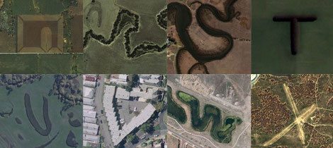
Creative director Rhett Dashwood, who is interested in creative media, including interactive, animation, branding, print, film making and digital art, was a bit bored in October 2008 and started for this reason to search for some letter-like landmarks and buildings in Google Maps. When he finished seven month later, in April 2009, he had created his own bird’s-eye perspective landform typography alphabet…fantastic, isn’t it?
If you think, you could do that even better, write me an e-mail and send me your result! Nothing is impossible…

typographically landmarks