Street Art & Graffiti Typography: Fonts & Lettering
Discover the creative world of letterforms in urban art. Explore diverse styles, from bold graffiti to delicate stencils, and the artists who master them. Dive into the history and evolution of typography in street art.
Explore the fascinating world of typography within street art and graffiti. This archive delves into the diverse range of fonts, lettering styles, and techniques employed by urban artists. From the bold, aggressive tags of graffiti writers to the intricate and detailed stencil work of street artists, we showcase the creativity and skill involved in transforming the urban landscape into a canvas of expressive typography. Discover the history, evolution, and impact of lettering choices on the visual message and aesthetic impact of urban art. Learn how different fonts and styles contribute to the identity and narrative of individual artists and the broader street art movement.
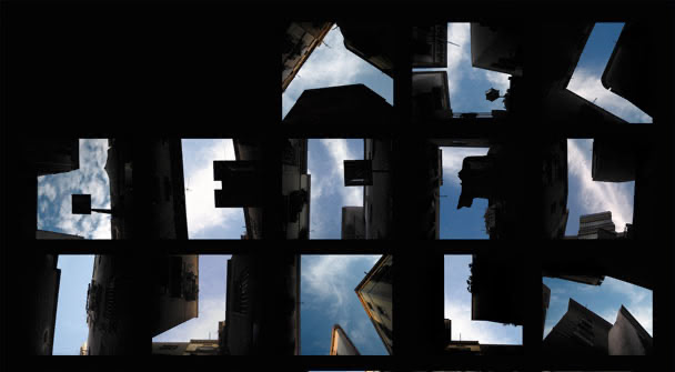
“Type the Sky” by Lisa Rienermann
Although Lisa Rienermann’s “Type the Sky” project is from 2007, I first heard about it yesterday.
“Type the Sky” is a photographic alphabet consisting of sky-snippets, which are framed by houses…it’s hard to describe…sorry! Take a look yourself!
It was awarded by the Type Directors Club New York in 2007 and was uses by the car manufacturers Mercedes and Renault for their advertising-campaigns!
In my opinion Lisa’s artwork is a great combination of my three major interests - as you know urban landscapes, typography and photography! For me it’s nice to see, what is possible with a sharped eye and a cam in a city!
...
Red Retro & Berlin Subway Stations
After modifying stations in Madrid and Valencia, Red Retro renamed some subway stations in Berlin between September 15th and 26th!
He changed for example “Alt-Mariendorf” into “Strg + Alt + Apple-Key”, “Alexanderplatz” into “Alexanderspass” and “Pankstraße” into “Punkstraße”. These changes are not digital - Red Retro uses original vinyl-transparency to make his mostly funny wordplays.
The aim of this creative urban interventions is to break through the wall of people’s daily routine and monotony and to provoke human emotions.
...
Linocut, Typography, Paris
About four months has Mark Andrew Webber spent to design his new artwork and the past two months he carves it: An enormous linocut map of Paris!
But that’s not the highlight! The whole map is a typographic interpretation of the French street and building names. With its 1.8 metres across, it’s an fantastic artwork!
“With this Paris map, I’ve tried my hardest to make it accurate, but I’m not a French speaker so it’s bloody hard. It’s just a lot of checking and I’d rather like the pieces to not have to be chopped up, as that kind of ruins it.” (Mark A. Webber)
...
Zoe McCloskey’s Lorem Ipsum Art
What do you think about the “Lorem Ipsum” placeholder text? I love it, and today i read an article about Zoe McCloskey from Chicago, who used this fake-seeming Latin designers use to mock up designs for a street art project. (“Fake-seeming”, because it is not really a fake text, but ask Wikipedia for more!)
She pastes sentences like “Lorem ipsum dolor sit amet, consetetur sadipscing elitr.” on walls and billboards to stimulate people to think about the meaning of words. But read yourself, what Unurth has learned from her:
...
Typography Poster Inspiration
Possibly the best source of inspiration for typography posters is available under typographicposters.com!
With the theme „feed and consume quality“, lashings of typographically influenced posters from the whole world are collected and presented there. For everybody searching for new inspiration for the next poster-collection, typographicposters.com with artworks by Via Grafik, Petros Voulgaris, Ralph Karam and many more is an amazing fundus!
Now, take a look, get inspired and put up your own typography posters!